3/27/08

Swiss Cheese


Graphis Design Annual 2004, p209
Swiss American Society of Pittsburgh, David Vissat, poster

This is a poster advertising a fundraising dinner for the Swiss-American Society of Pittsburgh. I thought is was very eye-catching and appropriate - a big slice of Swiss Cheese! The cutouts add dimension to the poster and the moon shape helps to emphasize its a nighttime event. The continuity of color in the yellow font helps to tie the information block to the visual cheese block. The placement of the black banner at the top of the poster reinforces the nighttime theme and the yellow words take on a stellar quality against the black background. Finally, the small usage of red in the upper corner acts like a magnet to the viewer's focus, drawing attention to the information block tightly presented next to it.

3/26/08

mmmmmmm........


Graphis Design Annual 2004, p179
Clara Confections, Stephen Goss Designers, packaging

I found this to be really innovative packaging. I like how each compartment has its own door and how each door opens in a different direction, making the packaging interactive. It offers a sense of wonder what's behind the next door.
The soft light color scheme is used consistently throughout the design, reflecting the hues of the food items. The bird and fruit theme also coordinates well with the selected foods - chocolate eggs, chocolate-dipped fruit, and whole wheat fruited bread.
This would make a very classy gift and I'm guessing most recipients would keep the empty wooden box for other uses, thus encouraging name recognition.

Going, going, gone....


Graphis Design Annual 2004, p180
Barsquare Wines, Anders Schmidt, wine labels

Another ingenuous marketing idea for a wine. This collection of wine bottles placed in order on a shelf tell a story by label pictures. It reminds me of a flip book where a "movie" unfolds in the corner of the book as you flip through the pages. Wine connoisseurs will want to buy at least 6 bottles of this wine just to show off the labels.
The labels are interesting in the way they portray a contrasting idea. The first label of an elegantly attired Elizabethan man in a formal portrait pose paired with the classy Olde English style font leads one to the impression that this is an expensive wine for serious people. But by the last label, our nobleman appears to be sloshed and falling off his stool, adding an air of lightness and fun to the nature of this wine.

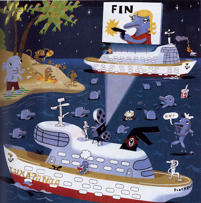
3/13/08

Symbols!


Society of Illustrators 46th Annual of American Illustration, p131
J. Otto Seibold, Editorial

I found this to be a great example of using symbols in Illustrator. Look at all of the symbols used - birds, stars, windows, anchors, dolphins. I also find this artwork entertaining because of the theme. This would be my husband's idea of paradise - movies on a boat in the tropics near an island. One question, why do you think the flag is on fire on the boat? The illustration was used in a summer movie preview article.