12/3/08

Letterman


Typography 23, 2002, p76
Greight Inc, Kosuke Shimuta, Japan


This is another use of letterforms to create a piece of art. The figure is composed entirely of symbols. This was one of a series of ads. I found this ad intriguing. The figure of the man appears rather airy, as if a a slight breeze would blow him away. And he doesn't appear to have a shadow but the solid black hat does. I cannot identify the font but the purpose is advertising.

12/1/08

Morpheus Music


The Big Book of Logos, 2000, p6
Morpheus Music, Brad Wilder, logo

I found this logo successfully incorporated music notes into the design without being obvious. Very subtley, the designer incorporated two vital elements of this company's identity into one symbol. If you look closely, you can see the letter M and music notes entwined, showing how Morpheus is synonymous with music. The overall design is intriguing and entices the viewer to look closer to figure out why. The font is Weiss and is used to create an identity.

Helping Hands


The Big Book of Logos, 2000, p17
Resource Link, Eric Sena, logo

I liked the concept of people helping people in the figures over the type, with the last figure placing the dot on the word Link. The flow of the bright red squares pulls your eye in and leads you down the line of type. The boldness of Link serves as an exclamation. The font used is Helvetica Neue and it serves the purpose of identity.

11/27/08

Seamstress


Typography 23, 2002, p116
Patti Katcha, Jennifer Katcha, business card

This card tells what the person does before it's even read. The sewing notches on the edges, the actual stitches and thread tails, the patterns on the back of the card—all point to a seamstress. This is a business card way beyond the ordinary. A card people will remember and want to keep. Even the font used to spell seamstress has an embroidered look. The package is completed by the soft faded card colors that coordinate well with the brown tissue patterns shown on the back. The fonts used are Filosofia and Found Type and the purpose is identity.

11/21/08

Take the Truth Lying Down


Typography 23, 2002, p99
The New York Times, Stephen Doyle, editorial

I liked the header created to go with this article. The designer took a word and created a picture worth a thousand words. By creating 3D letters, he was able to pictorially show how one has to take the truth lying down. Simple yet so clever!
The font used is Franklin Gothic Extra Condensed and it's used for editorial purposes.

11/19/08

Letterhead Definition


Typography 23, 2002, p134
Markus Friedrich, Mario Fuhr, corporate identity

I was drawn into this corporate identity because of its unusual presentation. It appears as a dictionary entry with the company name in bold. Instead of an explanation of the company, the normal business card information is listed. The vertical bar in front of the type reinforces the dictionary idea. It looks very simple yet it's so very clever. The font used is centennial and it serves the purpose of identity.

11/12/08

U2


Typography 23, 2002, p97
Rolling Stone, Ken Delago, magazine spread

I loved the layout of type in this spread. The way every thing fits inside a U and the way the 2 creates the center of the U. How the type flows around the shape of the U further emphasizing the 2. The bright red used to highlight the title , author, and the circular text block. Great balance! The Rolling Stone has done it again.
The font is Knockout,a serif font, used for editorial purposes.

11/7/08

Shrek


Typography 23, 2002, p96
El Mundo Metropoli, Rodrigo Sanchez, Spain, magazine cover

This designer turns out one fantastic cover after another. This one features a typographic representation of Shrek. At first glance, it appears to be created by crayons. In actuality, it is one line of text repeated over and over—"Shrek es el nuevo heroe". I liked the layer effect he achieved. The bottom layer looks like a newspaper clipping and it appears to be colored. The designer repeated this effect in creating the masthead. The fonts used are Letter Gotic, Giza Seven Nine, and Cloister Old Style.

11/5/08

Knoll Christmas Card


Graphis Design Annual 2002, p226
Knoll, Lynda Decker, Christmas Card

I found this to be a rather clever Christmas card. I liked how the bright red ho ho is interspersed within the company's name. No need for any further writing. This simple card says it all—the company's name and merry christmas, in a roundabout way. The font is a very clean sans serif, perhaps Helvetica Bold.

11/3/08

My favorite Christmas card


Typography 24, 2003, p71
Stoltze Design, Roy Burns, Holiday card

I loved this Christmas card even before Typography. How contemporary is this? Only font. In case you can't see the picture very well, L is missing from the alphabet printed on the front of the card. N and O are highlighted in red. The missing L reappears on the inside of the card in the signee's name, highlighted in red. The hidden message - No L! Love it, love it, love it! The font use is Historical Fell and the purpose is correspondence.

10/27/08

GQ story header


Typography 24, 2003, p119
GQ Magazine, Paul Martinez, magazine page layout

This is the opening page to a magazine spread about Tobey Maguire coinciding with the release of a Spiderman movie. The words climbing up the buildings are symbolic of Spiderman climbing skyscrapers. The smaller type in the design is spaced and sized to look like lit windows in the buildings. By cleverly placing the author and photographers names sideways in what appears to be random spots, the type loses the look of letterforms and enhances the idea of windows. If the type had been placed vertically, the viewer would have been more focused on the actual letters and would not appreciate the artistic effect the designer was after. I also found it clever that the article actually begins on this page within the framework of a building. Notice how the color treatment of the letters aids in the windows illusion.
The font is Gotham (how appropriate!) and is used for editorial purposes.

10/21/08

Half Moon Catering


Graphis Design Annual 2002, p149
Half Moon Catering, Amy Johnson, letterhead

I enjoyed the logo and the layout for this corporate identity package. The "moon" is actually a cup and saucer in heavy shadows. I found it interesting in the way the designer kept the imagery completely separate from the informational text. I also found it interesting that the type in the logo is all caps and actually works. Every source I read states this is a big no-no. Obviously, an exception to every rule.
The font is a thin sans serif serving the purpose of identity.

10/17/08

ai


Typography 27, p57
Pratt Institute, Hsin-Yi Wu, student project

I loved this layout. The designer chose random people off the street and had them pose as letters. The paragraphs (in Garamond) on the side tell about the persons. I like how the little girl's balloon forms the dot over the i. The designer did a great job of balancing the elements. The large red i creates a strong point with the white space surrounding it helping to emphasize it. The paragraph font serves the purpose of informing while the large letters are used purely as decorative elements.

10/14/08

Have a seat


Typography 27, p137
Commissaires, David Guarnieri, poster

I have no idea what this poster says but I'm guessing it's an art exhibit. I enjoy how the text is used to replace parts of the chair. It makes me want to read the poster to see why. My favorite part, though, is the single line of text below the chair. I found it interesting because it was placed at the same angle as the chair, which I find unexpected. The text used is Didot and my guess is its purpose is informative.

10/13/08

Atmosphere


Typography 27, p141
Anti-Pop Festival, Dirk Fowler, poster

I thought this was a rather bizarre poster. It makes me feel like I need 3D glasses to focus. I was intrigued by the type, the way the letters tucked into each other. Very geometric. And the M looks like a sideways E. It has a 70ish feel to me. And for some reason, instead of the figures flying up, I feel like they're actually falling but have just been turned upside down. They look like diving forms. The fonts used are Handcut and Twentieth Century, both sans serif fonts, used for advertising purposes.

10/1/08

Don'tnut


Typography 27, p59
California College of the Arts, Julyanne Liang, student project, billboard

I found this project to be quite eye-catching. My first thought was it was going to be something against the Dunkin Donuts franchise since it basically copies their logo font and colors. It is actually a call to arms to fight teenage obesity. Although, I'm sure Dunkin Donuts would probably fight this billboard if it were actually used. I thought it was a pretty clever play on words. The fonts used are Frankfurter and Futura, both sans-serif fonts. The purpose of the type in this billboard is informational.

A Bottle of Red


Typography 27, p48
John Anthony Vineyards, Liza Butler, packaging

This wine label seems simple but I find it to be elegant. I liked the shape created by the overlapping letters. The Y at the bottom creates the base of a tree. Each layer of stacked letters is smaller in size until the top letter J. The large J on top helps to guide your eye to begin at the top of the tree and read downwards. The letters forming the tree have enough transparency that you can see a darkening where the letterforms overlap. The wine variety is printed in red helping to identify it as a red wine. The fonts used are Centaur and HTF Requiem and the purpose is packaging.

Just for fun!


Typography 27, p56
Muthesius Kunsthovhschule Kiel (School), Rene Siegfried, student project

I had to share these just because. I loved the art created by the letters. I like how the "girl" is present in each scene and how she seems to take on a different personality based on the angles of the letters used to create her. For example, if the d used to create her head is tilted more horizontally, she looks like she's looking up. Each rectangle seems to represent a new geographical destination and the last last rectangle shows all roads lead to the same place, but I'm not sure what that means. Maybe all letters serve the same universal purpose?
The fonts being promoted include Futura Book, Adobe Garamond, Shelley Andante Script, and Zentenar-Fraktur.

9/30/08


Typography 27, p280
PampaType Digital Foundry, Rayuela Chocolate 2.0, Alejandro Lo Celso, poster

What a fun way to display a typeface! Typography has taught me the importance of that little g and boy, does this poster show it. I love how it's the center of attention surrounded by all of the other letters. It's amazing how much detail is in a letterform when it's blown up out of proportion and you can see all of the little nuances. I found myself looking at the other letters around the wheel to see what else stands out. But, here's the best part - the font is named Rayuela Chocolate. Who wouldn't like a font named after chocolate? Kind of makes me wonder if the font is arranged in a circle to represent a chocolate candy and the g is the filling inside.
The font is a very bold serif and this is an example of self-promotion in a Barnum and Bailey sort of way!

Aniene


Typography 27, p285
Elsner & Flake, Adriane Krakowski, poster

This is a type poster for a typeface called Aniene designed by Adriane Krakowski from Germany. I like how the font is used to create the outline of a Roman statue which seems to hint that the font itself has classic Roman characteristics. I found it interesting how the designer incorporated the alternate characters into the alphabet lines and highlighted them in red so they were noticeable. The purpose of the font in this case is self-promotion.

Section8


The Big Book of Logos 3, 2002, p108
Maysville Pictures, Gord Woolley, logo

I enjoyed the play on the word eight in this logo with the letter E being formed by the actual number. It's a simple logo with a twist, stirred not shaken. The use of two similar sans serif fonts seems to work in this case, the contrast being made by the weight of the font. The use of yellow helps to emphasize the Roman numeral 8. The word SECTION is identified as sanzettica 1 thin font and IGHT is Copperplate classic sans font. The use of font in this case is identity.

9/17/08

Something smells fishy!


The Big Book of Logos 3, 2002, p67
Ed Cervantes, Jack & Bonnie Evans, logo

This designers did a great job with distorting the fonts to look like fish bones yet still be readable. It was a great choice of font with serifs that could be easily stretched. I like the horizontal line that goes across the fish and adds to the effect of the letters being bones, and the use of a red dot on the i conveniently placed for an eye. The font is Goudy Trajan and is used for identity.

Bill! Ballenberg!


The Big Book of Logos 3, 2002, p59
Bill Ballenberg, Gary Skeggs, logo

I loved the simplicity behind this design. Very clean, very clear, very stark. It would make a great sign for a political candidate. The font is gill sans and the purpose is identity.

Songwriter Records


The Big Book of Logos 3, 2002, p266
Songwriter Records, Damon Meibers & Derek Aylward, logo

I like the big-eye bird on this logo but what really set it off was the upside down m used for the w. It makes you look twice. And so does the eye that's looking back at you. The use of two different fonts and two sizes of fonts help to establish a good design. The "songwriter" font is a rather decorative, casual serif but I was unable to identify it. The footers on the m and n are rather unique. The "records" font matches very well to Ocean Sans Std.

Avant Garde


The Big Book of Letters 3, 2002, p336
E. DeMartino Design, Eric DeMartino, logo

I found this to be a very simple but clever logo. Highlighting de in the top line of type instead of the bottom adds a lot of action to the design. It makes you stop and look closer because it appears the word design has been bisected. The use of all small letters where you expect to see capital letters and the use of 2 very strong contrasting colors is also engaging.
The font is identified as Avant Garde Demi which is a sans-serif geometric font often used for display. Here it's used to create an identity.

liquid


The Big Book of Logos 3, 2002, p325
Liquid Agency Inc., Alfredo Mucinno & Joshua Swanback, logo

I like the contrast between the fluid liquid droplets and the stiff upright letters, which is also emphasized by the color contrast. I find it interesting how the d breaks the border of the droplet. It makes the word look less contained. The vibrant color choice leads me to immediately think of water and seems to make me thirsty.
The font is Futura, a geometric sans-serif typeface. The purpose here is to establish an identity.

9/12/08

Chicago


The Big Book of Logos 3, 2002, 124
Chicago, Davis Harrison Dion, logo

I loved the use of the I as the Sears Tower in this Chicago logo. It's a perfect identity symbol for Chicago. The use of orange and blue links Chicago to the state of Illinois, which, in turn, seems to align itself with the University of Illinois. The large letters stacked on top of each other and in close proximity seem to mimic skyscrapers crowded together in the city.
The font is Gloriola Display Standard Fat according to What the Font. The font is sans-serif and is used as an identity.

Brandable


The Big Book of Logos 3, 2002, p48
Brandable, Erika Kao, logo

This logo caught my eye for two reasons. The first was the irony in the image. UPC codes seem so generic and the way this ones morphs into something unique seemed to emphasize the company name Brandable. It's like saying our product is special enough to have its own identity and not just be another number. The second reason I was drawn to this logo is because of how well the font correlated with the UPC bars and the uniqueness of the D. I thought it was interesting how the the other letters had rounded bowls but the D was pointed.
The font was immediately identified by WhattheFont as OCRA. The style is sans-serif and the purpose is identity.

Fun with Letters!


The Big Book of Logos 3, 2002, p20
Albuquerque Arts Alliance, Dean Gianopoulos, Tom Antreasian, Kevin Tolman, logo
This reminded me of the face exercise we did. I thought it was a very clever logo since the a's are connected representing an alliance. The double a's stand for Albuquerque and Arts, and the underlying bracket reinforces the concept of an alliance. I tried the font identifiers but couldn't find a match for the typeface. The style is a sans-serif and the function is identity.


The Big Book of Logos 3, 2002, p24
Henning Gutmann - The Gutmann Group, Mary Valencia, logo
I chose this example because of the emphasis on the letter g. I've learned that this letter is important in determining a typeface and I've noticed some type posters tend to use the g as a background image (including mine). I really like the g. It's such an artsy letter. I thought this logo used the g very effectively. It is another repetition of a visual g that reinforces the company's name. It looks like the gutmann group is looking at you!
The font is gill sans and the function is identity.

8/31/08

More Font posters

Bodini


Bodini Font Specimen Sheet, Just Creative Design, Jacob Cass
http://justcreativedesign.com/2008/03/17/what-is-a-font-flags-specimen-sheets/

I really like how this poster is layed out - the layers, the repetitive elements, the type following the curve of a letter form. The poster seems to have all of the graphic design elements: unity, emphasis, balance, rhythm, and depth. The designer's site does a great job of exlaining font speciment sheets and has many interesting and informative links.

Typography Posters

Marcos Crespo, student


Amanda Bonilla, student


Ursala Palladino, student


Brian Bellissimo, student


Katie Simari


These were several examples of student work found at: http://www.flickr.com/photos/vccgraphics/sets/72157594204888427/

These will help to inspire me on my own font poster. I was amazed at the variety!

8/27/08

Red Lobster Billboard


Red Lobster Billboard
North Mattis & I-74

I thought this was clever with a shrimp used as a G. It made me look so I guess it worked. I didn't have much luck identifying the font. The E wouldn't match any of the fonts suggested by online sources. It reminds me of the titling fonts mentioned in our textbook. It's definitely a serif and used as display text to advertise.

The letter "m"


Print, Mar/Apr 2000, p88
Iteineraria, BCPT Associati, poster

I found this poster interesting because of the play between the letter "m" and the negative space created by the fork. The letter "m" is the focal point but the interaction with the fork immediately draws your eye up and over to the red lettering explaining the event. The information block further grabs your attention because it is unexpectedly printed sideways. Great use of font to employ visual interest!
The font is Bodini, a serif style.

4/30/08

Sound Painting


Society of Illustrators 46th Annual of American Illustration, p186
Rudy Gutierrez, Roy Hargrove CD

I love the artwork on this CD cover. Roy Hargrove is a jazz trumpeter and the designer's goal was to create a "sound painting". I think the designer was successful. The warm, rich, vibrant colors used reflect the warmth and energy of the music and are representative of the stage lights. The black emphasizes nighttime and suggest the trumpeter is playing for a nightclub. The overall feeling I receive with the colors is that the people are in the dark recesses of a nightclub and the music is lightning the room. I like the looseness in form created by little dashes, unconnected lines, splashes and dots of color, the "torn" paper with the title that's been "carelessly" scratched through with crayon. All of these little details reflect the lack of uniformity jazz music strives to perfect.
It seems that each detail in this artwork contributes significantly to the composition. The emphasis is obviously on the trumpeter. Starting in the upper corner, your eyes are directed down the arm and trumpet toward the dancing couple. Notice how the trumpeter, the dog, and the man in the bottom corner are also looking at the dancing couple which are spotlighted by the bell of the trumpet. I kind of getting the impression that the trumpeter is an angel looking down from heaven. Perhaps he's Gabriel with the message of music.

Symphony Party


Graphis Design Annual 2004

I've lost my original source data for this poster, but this is what I remember. It was a poster for the Pittsburgh or Philadelphia Orchestra advertising a dinner celebeating it's 75th year. The poster caught my eye because the idea of a party and an orchestra seems like an oxymoron to me. I think of an orchestra as being a very serious, subdued event - the complete opposite of a party with horns and noisemakers. I liked the simplicity of the poster's image. It's very clean, very eye-catching. I wonder, though about the readability of the copy. In the book, it is next impossible to read. Hopefully, the actual poster was readable.

4/24/08

Shadows


Society of Illustrators 46th Annual of American Illustration, p228
London's Transport Musuem, Necdet Yilmaz, poster

This is a poster "designed for a London-wide campaign to remind citizens and visitors of the city's rich cultural heritage and current cultural output." I found it really interesting to study it in order to figure out all of the shadows and what they symbolized. My favorite was the little dog with the big dinosaur bone shadow. This is a very clever publicity poster since it will engage the viewer to continually look for hidden items each time they see it at transportation terminals throughout the city.
I had the impression of being a bird overhead watching two conflicting traffic flows. It feels like the people are pulling you out of the poster toward the bottom while the shadows pull you upward. This parallels the conflict between the historical and current events. It also makes my focus jump all around the poster. Great effect for interaction. The other thing that I notice is how the red bus seems to ground the whole composition. The big patch of red livens up the gray background and seems to anchor the little patches of color scattered throughout the poster. Imagine the poster without the red bus - not nearly as interesting!

4/10/08

See the City!


Graphis Design Annual 2003, p175
The Swedish Museum of Architecture, Anders Kornestedt, Signage

These are signs for the Swedish Museum of Architecture posted around Stockholm. They are frames attached to posts and are positioned so that they frame a significant architectural landmark when viewed from the correct angle. The 3-dimensional depth of the frame helps to add to the illusion of it appearing to look like a picture. Very eye-catching! The added benefit of this signage is that it reminds the population of the beauty of their own surroundings. It points out views and landmarks that are taken for granted.

Nostalgic CD Packaging


Graphis Design Annual 2004, p
Saint Louis Black Repertory Company, CD packaging

This cd set reminds me of my mother's old record album sets. The sets were packaged in a cardboard box with each album in a brown sleeve, and, yes, there were places to write about the records inside the lid of the box. Even the cd labels are in the correct vintage style with era-appropriate font. Since this music will probably appeal to a mature, i.e. older, audience, I think the packaging is very clever. It will have great nostalgic appeal. I wouldn't be surprised if this set sold just because of the packaging

3/27/08

Swiss Cheese


Graphis Design Annual 2004, p209
Swiss American Society of Pittsburgh, David Vissat, poster

This is a poster advertising a fundraising dinner for the Swiss-American Society of Pittsburgh. I thought is was very eye-catching and appropriate - a big slice of Swiss Cheese! The cutouts add dimension to the poster and the moon shape helps to emphasize its a nighttime event. The continuity of color in the yellow font helps to tie the information block to the visual cheese block. The placement of the black banner at the top of the poster reinforces the nighttime theme and the yellow words take on a stellar quality against the black background. Finally, the small usage of red in the upper corner acts like a magnet to the viewer's focus, drawing attention to the information block tightly presented next to it.

3/26/08

mmmmmmm........


Graphis Design Annual 2004, p179
Clara Confections, Stephen Goss Designers, packaging

I found this to be really innovative packaging. I like how each compartment has its own door and how each door opens in a different direction, making the packaging interactive. It offers a sense of wonder what's behind the next door.
The soft light color scheme is used consistently throughout the design, reflecting the hues of the food items. The bird and fruit theme also coordinates well with the selected foods - chocolate eggs, chocolate-dipped fruit, and whole wheat fruited bread.
This would make a very classy gift and I'm guessing most recipients would keep the empty wooden box for other uses, thus encouraging name recognition.

Going, going, gone....


Graphis Design Annual 2004, p180
Barsquare Wines, Anders Schmidt, wine labels

Another ingenuous marketing idea for a wine. This collection of wine bottles placed in order on a shelf tell a story by label pictures. It reminds me of a flip book where a "movie" unfolds in the corner of the book as you flip through the pages. Wine connoisseurs will want to buy at least 6 bottles of this wine just to show off the labels.
The labels are interesting in the way they portray a contrasting idea. The first label of an elegantly attired Elizabethan man in a formal portrait pose paired with the classy Olde English style font leads one to the impression that this is an expensive wine for serious people. But by the last label, our nobleman appears to be sloshed and falling off his stool, adding an air of lightness and fun to the nature of this wine.

3/13/08

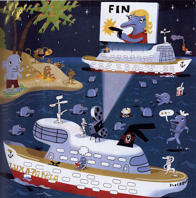
Symbols!


Society of Illustrators 46th Annual of American Illustration, p131
J. Otto Seibold, Editorial

I found this to be a great example of using symbols in Illustrator. Look at all of the symbols used - birds, stars, windows, anchors, dolphins. I also find this artwork entertaining because of the theme. This would be my husband's idea of paradise - movies on a boat in the tropics near an island. One question, why do you think the flag is on fire on the boat? The illustration was used in a summer movie preview article.

2/28/08

Belazu Olive Oil


Graphis Design Annual, 2006, p173
Turner Duckworth, packaging

I found this design to be really clever. The "olive tree" is actually an olive sitting in the palm of a hand. This suggests to me the product is fresh from the grower, perhaps even picked by his own hand. The blue is a very interesting choice of color. It's different enough to stand out and seems to draw your eye to the label. The font also ties in well - bold but not overwhelming, pretty classy.

Figure Skater


Society of Illustrators 46th Annual of American Illustrations, p85
The New Yorker, Carter Goodrich, cover

The intent of this cover was to "comment on how vicious the sport of figure skating has become". Viciousness is not the message I got; competitiveness would be a better description. I found this design to be an great example of the design principles working together. Notice how the one little dark, clearly-defined puck balances against the mass of the children. The gradient at the top not only creates depth but provided an nice contrasting background for the magazine title. The use of white font allowed the entire composition to maintain an overall wintry feel. Any other font color choice would have completely changed the composition. The other interesting thing I noticed about the gradient is the subtle texture that was used created a haziness appropriate to winter and helped to integrate the trees in the background. Emphasis is clearly placed on the lone figure skater dressed in red and displaying a very evident expression of disgust. Rhythm is found in the carved circles on the ice. Even the group of children are surrounded by a circle of fairly evenly-spaced hockey sticks. Unity is seen in the proximity of the 3 groups - skater, children, and net. Unity is also found in the repetition of colors and in the repetitive "L" shape seen in the hockey sticks, the skater's bent leg, and the hockey net frame. The complimentary colors complete the harmonious composition by being of equal values.

2/21/08

Identity Theft


Workbook 26, Illustration and Design, p305
Marlena Agency, Tomasz Walenta

I love the symbolism of this "simple" design. It's a perfect icon for identity theft. What better way to represent personal identity than a fingerprint? The bright yellow "caution" background helps to capture the viewer's attention. The added details of the thief's mask and the binary code on the bottom of the illustration emphasize the meaning of the symbol.